

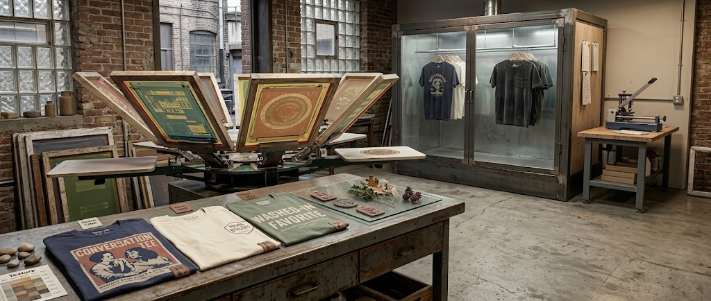
Vintage-style does not have to mean fake damage or a costume version of an old shirt. The best examples use color, ink, fabric, and proportion to create a tee that feels relaxed from the beginning.
Muted color is easier to wear
Rust, faded navy, cream, olive, and softened red sit comfortably beside denim and neutral layers. They still carry personality, but they do not fight the rest of the outfit.
Texture gives the artwork depth
A perfectly flat block of color can feel more like a digital sticker. Distressed or reduced-ink effects let a little fabric character show through, giving the graphic a more tactile appearance.
Scale changes the mood
Small chest graphics feel understated. Large centered prints feel like posters. Vintage-inspired designs often sit between the two: large enough to read, but not so large that the shirt becomes a billboard.
Fit completes the effect
A relaxed shoulder and a body with room to move support the lived-in look. The goal is comfortable proportion, not simply buying several sizes larger.
Wear is part of the story
With appropriate care, small changes in softness and surface texture can make a graphic tee feel more personal. The shirt becomes associated with real weekends, repeated outfits, and the places you actually wore it.
That is the appeal: not pretending a shirt is old, but choosing one designed to become a favorite.